The effectiveness of a design solution has always been a slippery thing to measure.
Clients don’t commission branding work for fun – it has to deliver on its objectives. But unless initial investment can be measured against some hard results, success can feel very opaque, perhaps just a vague ‘sense’ it’s better than it was before.
Design is not a magic bullet, and won’t save a product or service with deeper underlying issues, be it board trouble, logistical problems or a changing marketplace. But in a market with little to differentiate products that are fundamentally the same, a strong, distinctive brand can be the difference between success and also-ran.
Art meets science
When it come to measuring that success, part of the problem is that design, at its heart, is half art, half science. This mid-ground is also what makes it endlessly fascinating to all of us at GW+Co. It’s a creative discipline, but applied to real world problems with practical goals. If it were all science, there would be a proven, clear methodology to solving design problems. Success would be entirely measurable. But that would lose the little bit of magic that makes great design great, and of course everything would look the same, removing any brand differentiation. If it were all art, value judgement would rest entirely in the eye of the beholder. (There’s inevitably an element of subjectivity as it is.) There would also be no brief to tether creative flights of fancy to (or to restrain designer egos), and the effectiveness or otherwise of the solution would be completely unprovable.
So we sit somewhere in the middle. If a brand is successful, judgement of design merit has to be somehow isolated from other factors that may have led to success: investment, new product ranges, sales region expansion, media spend etc.
Measuring up
And there are different measurements of success. The obvious one is sales – if a rebrand coincides with a marked rise in goods shifted, it looks likely one has affected the other. To check this, you might survey some of these new customers for their perceptions on the brand. (Ideally, they’ll have been a pre-rebrand perception survey too, so you can measure the difference.) There’s the internal effect, too – if sales teams and management have a spring in their step thanks to the new design work, this can only lead to good results, and surveys or testimonials can identify this. Simple brand awareness is another measure – we are bombarded with brands every day and being able to recall one that stands out from the pack is an achievement in itself.
Digitalisation means there are some concrete analytics to measure online. Number of website visitors, how long they spend there, newsletter sign ups and social media engagement can all give pretty clear indications of interest, if the web presence has been overhauled (as is normally essential for any real change). If the redesign includes a digital service or e-commerce site, the user experience will be part of the design change, and that’s getting closer to the ‘science’ end of the spectrum.
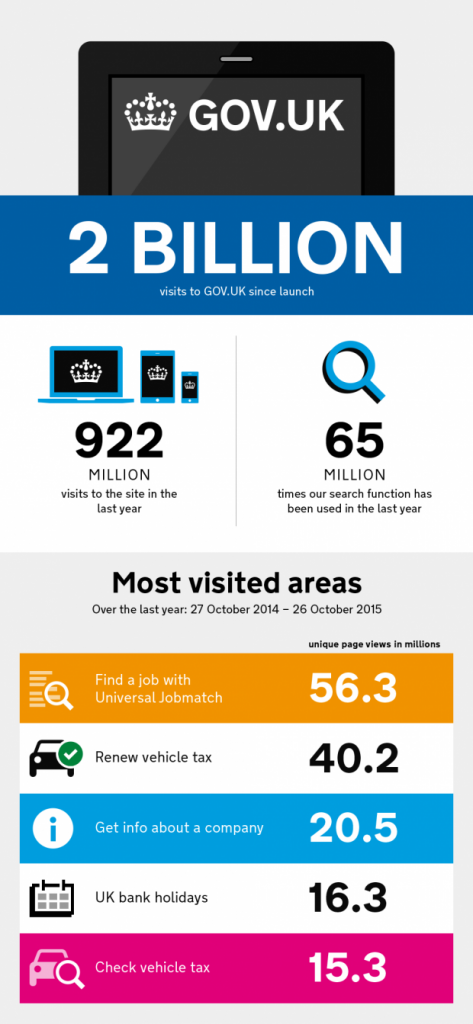
The overhaul of all UK government online services to one redesigned platform, gov.uk, is perhaps one of the clearest examples of effective design. The ‘subjective’ look and feel is kept deliberately neutral, and huge effort has been put into making the functionality as smooth and seamless as possible – a ‘relentless focus on the user’ as they put it. Usage of government services online has shot up across the board, giving clear success metrics. (And they’re publishing it all online).
But the government doesn’t have to compete in a crowded marketplace. In the private arena, if every competitor has a ‘relentless focus on the user’, they may all start to look a bit samey and therefore harder for customers to remember. Time to review the brand?
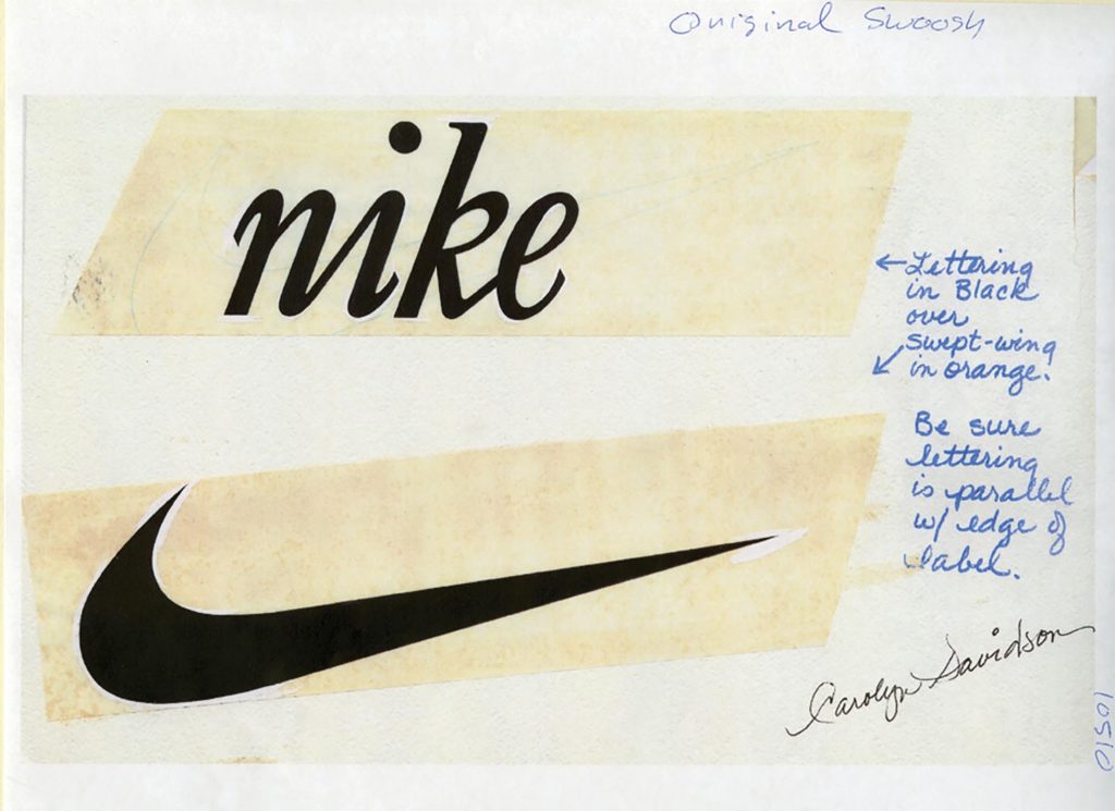
The other factor in branding success is time. As long as the company’s doing well, the value of a brand can increase exponentially as the years go by. Everyone knows the story of Carolyn Davidson designing the Nike logo for $35 in 1971 (she was later rewarded in stocks). These days, you simply couldn’t imagine Nike without it. But after only a year or two, before they’d conquered the world, would its effectiveness have been measurable yet? And how to unpick the logo’s power from that of the hundreds of ad campaigns, sponsorships and product launches that also contribute to the brand’s perception?
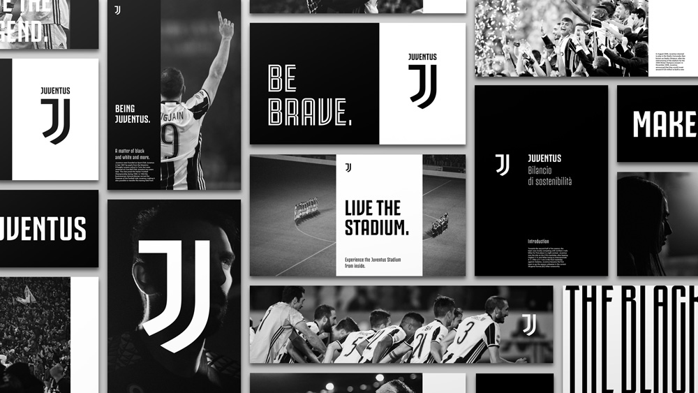
Nowadays, time is in short supply. Every major radical rebrand is accompanied by an army of online commentators ready to slate it or start a petition for the old one’s reinstatement. The huge Italian football club Juventus recently released a radical rebrand that dispensed with century-old tradition of what a football crest should look like. Of course, traditionalist fans got their pitchforks out but it’s clear the club has seen the opportunity to tilt at becoming a ‘premium lifestyle brand’ with all the merchandising opportunity that come with it. Effectiveness remains to be seen…
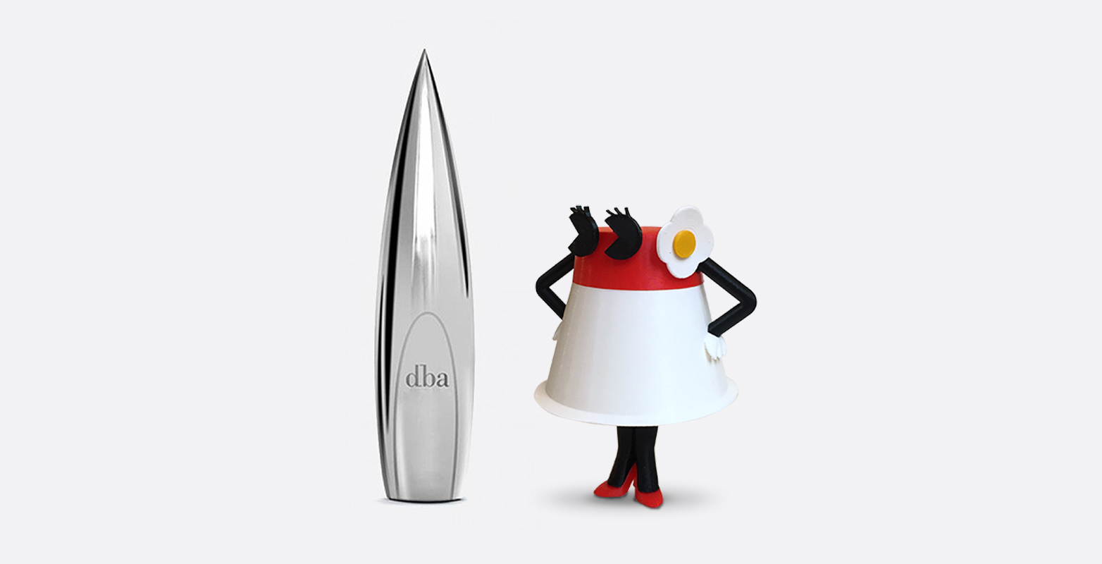
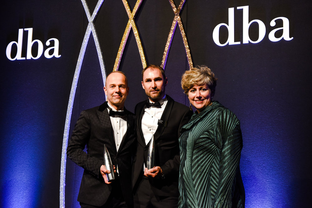
For us at GW+Co, this has all been on our minds since entering, and indeed winning, a 2018 DBA Design Effectiveness Award for our work repositioning THORNeco. The DBA, or Design Business Association, runs the only awards in the UK dedicated to business success and not the whims of a jury of creatives.
THORNeco was a range of low cost lighting that struggled to find its voice in a commoditised market. By taking a consumer approach to these wholesale products, we gave them very personal names like Amy, Julie and Mike, and a ton of personality through illustrations and animations.
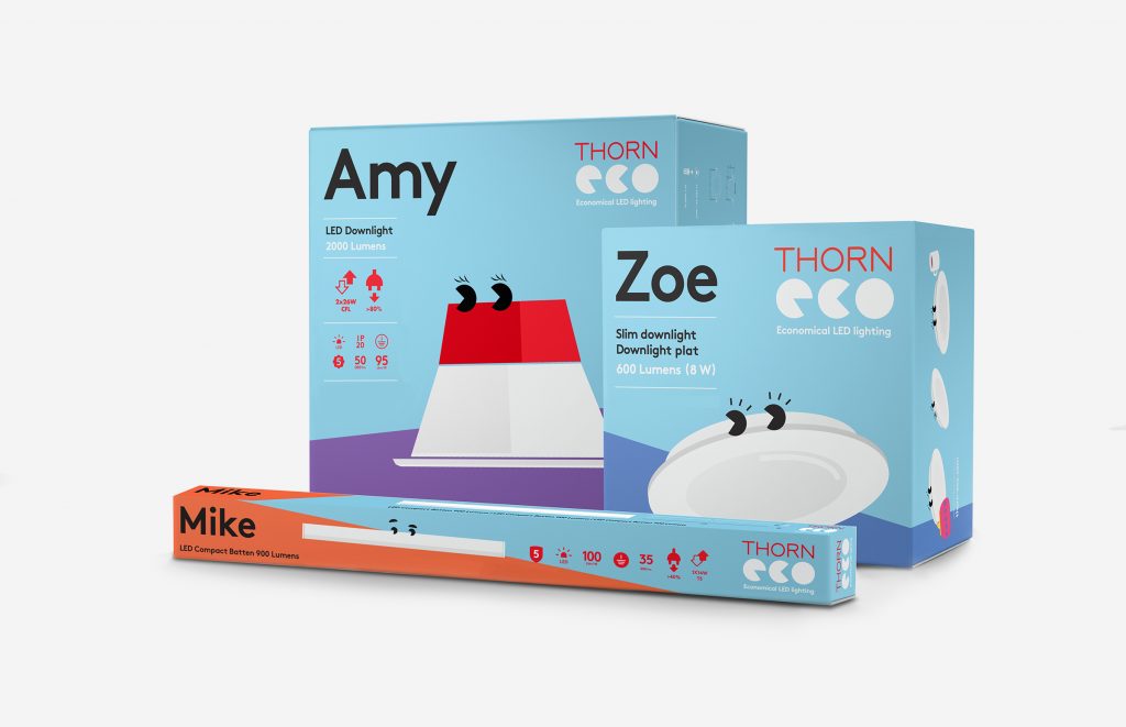
Entering the DBAs required us to find the proof points that conclusively proved the success of the rebrand. Sales went up 300% in three months. Stockists increased by 350%. Two-thirds of survey respondents told us that the new branding shifted perceptions from ‘good quality but expensive’ to ‘good value’. The brand has increased its presence to 17 new export markets.
We’re thrilled that our creative work has had a real impact out in the world, and of course delighted by our shiny piece of silverware. We’ll end with a gratuitous client testimonial…
“ The level of awareness and sales we’ve achieved with wholesalers in a very short timeframe is incredible. This is down to a provocative brand concept that, frankly, rattles a very conservative sector. It has demonstrated to our group that a bold and courageous design strategy can achieve real business results.”
Jens Milnikel, Executive Vice President, Business Division SPP, Zumtobel Group
Read more about the project here, and more about our DBA win here.
Joseph Harries is Design Director at GW+Co

