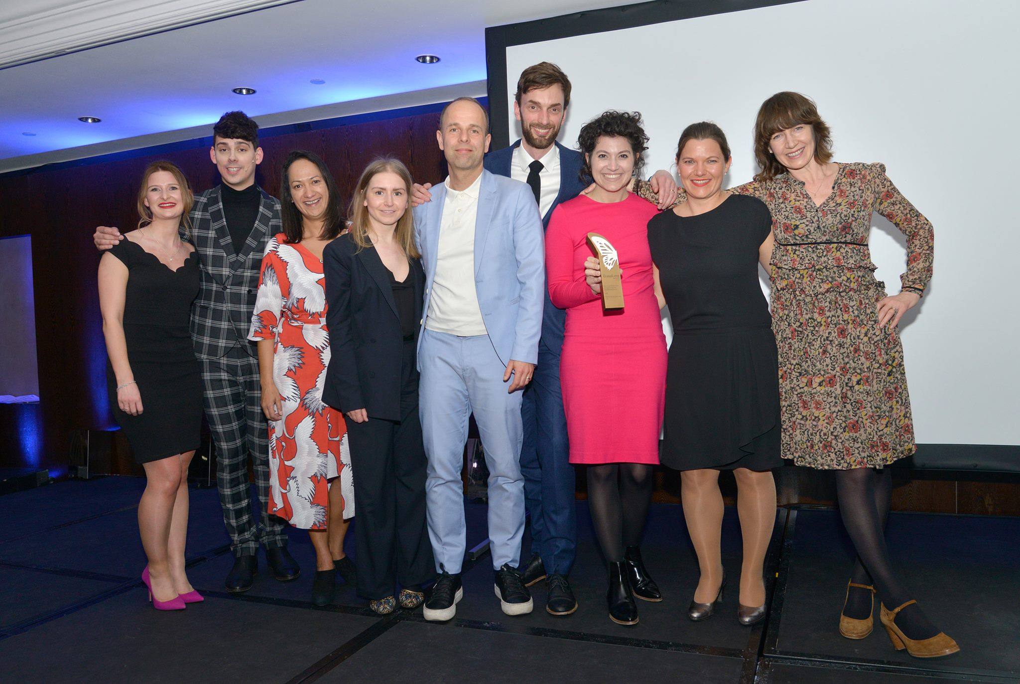
Last night we won two Golds, two Silvers and one Highly Commended at the 2018 Transform Awards, for four different client projects!
These awards recognise best practice in corporate and global brand development work, with categories that focus on strategy, execution, content and evaluation. But, for the heart of the matter, the clue is in the name – they celebrate the art of transformation. As change companions, we get excited by uniting teams and experts – from all sides – around a shared purpose which fosters a real sense of belonging. After all, transformation has to come from within. So, we are super proud of the GW+Co team, and, perhaps even more so, of our client’s who have rolled up their sleeves and brought so much enthusiasm to the collaborative process. Here’s what we did…

Reiss
Gold – Best visual Identity From the Engineering and Manufacturing
Silver – Best use of a Visual Property
Reiss have been making lighting for 90 years. They specialise in lighting extreme environments of all kinds – from oil rigs and arctic vessels to steel plants and pollution-heavy road tunnels. Anywhere you really don’t want the lights to fail. Historically a white-label producer, Reiss turned to GW+Co to help them fulfil their ambitious plans for growth via a new customer-facing brand. A strong strategy emerged, based on the brand idea ‘when lighting gets tough’. We brought it to life by building an illuminated model of the new logo and subjecting it to elemental forces. The resulting brand film captures the logo withstanding balls of fire, waves of water, explosions, freezing ice, corrosive smoke and heavy impact. In a sector with little personality, the new brand has launched with big impact.
THORNeco
Gold – Best Creative Strategy
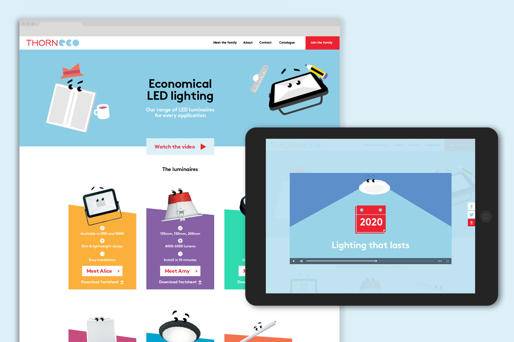
GW+Co helped launch a new product range called THORNeco – a new economical range of LED lighting, targeted at electricians and sold via wholesalers over the counter. The strategical breakthrough came when we asked why we couldn’t brighten up the sector (pun intended) by applying a retail approach to the somewhat drab trade market. Products were given real names, creating a true product ‘family’. Instead of using product photographs, the lights were illustrated in a distinct, simple and cheerful style, each with different personality features – literally adding character. This project has also won a prestigious DBA Design Effectiveness Award thanks to a 300% uplift in sales in the first 3 months after the relaunch and expansion into 17 new countries underway.
acdc lighting
Silver – Best Use of Copy Style or Tone of Voice
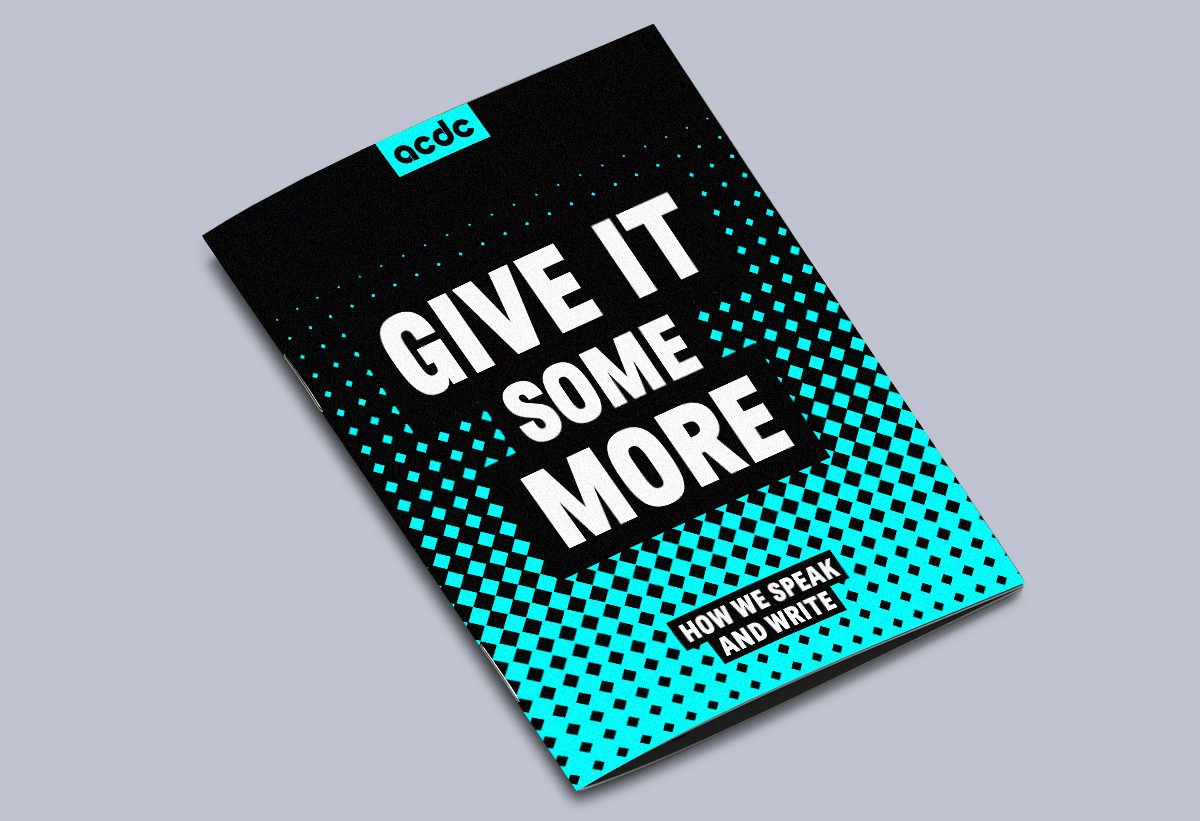
acdc (no, not the band!) design and manufacture architectural LED lighting. They specialise in making buildings come to life with creative, impactful lighting. In real life, they’re bolshy, straight-talking Northerners, full of enthusiasm. But in their brand’s writing, they sounded like everybody else. We needed to find a tone of voice that felt true to this. So we worked together to define what makes them them. The result was: EDGY, FULL OF LIFE, and HONEST. Using these three qualities, the whole brand was revitalised with a new look and feel centred around bold written statements. We expanded on the copy style to create a whole tone of voice guidelines, printed like a fanzine.
Lichfields
Highly Commended – Best Visual Identity in the Professional Services sector
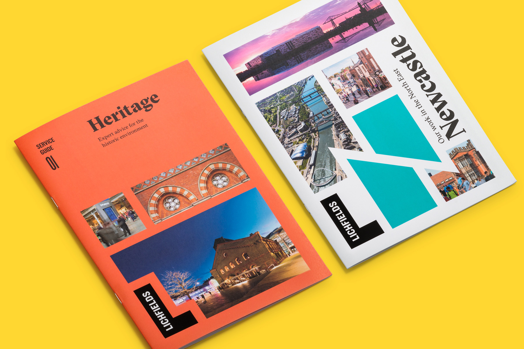
Lichfields has played a pivotal role in UK planning for decades. They’re one of the original consultancies that arbitrate between property developers and local authorities. But their name, brand identity, tone of voice and website were all out of step with their ambitious growth strategy. In collaboration with JWDK, we set about changing this. It soon became evident Lichfields stood out by looking at the big picture – they had a bird’s eye view of the evolving urban landscape. From this insight, we came up with a brand language based on the forms of buildings seen from above. This highly flexible system, along with new typography and a vibrant colour spectrum, is both highly usable and stands out a mile from identikit competitors.
Our principal Gilmar Wendt writes a little more about what went into some of these ‘transformations’ here.
Full results list on the Transform website.
Gilmar Wendt is the Founder and Principal of GW+Co.
Contact him on gw@gilmarwendt.com @gilmarwendt

