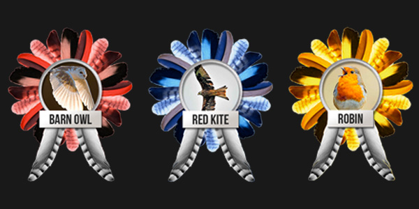
With a UK election just over two weeks away, there’s also been some press recently for a piece of electioneering a long way from Westminster – a public vote to find the first Official Bird of Britain.
We have never had a national bird. The poll closes on election day, with the plan being to take the result to whoever’s in charge after that for the official nod.
Far from being frivolous, this could be an important part of our country’s brand. Once you have a flag, some nice bank notes and a rousing anthem (not that we couldn’t use a rethink there), a national bird has to be next on the list for shaping a country’s identity in the public mind. Think of the insouciant, strutting French cockerel, the big, bold bald eagle of the USA, or the sense of we-do-things-differently-down-under of the emu and kiwi.
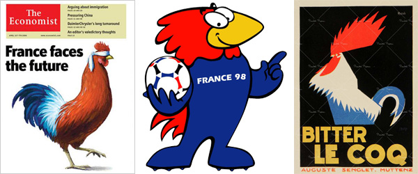
The importance of strong nation branding has been increasingly recognised by public bodies and tourism authorities globally in the past few years, and the UK should take any help it can get. Futurebrand’s latest nation branding report puts the UK 12th in global brand strength but has London well in front of it, second in strongest city brands. The current conversation about attracting investment and tourism away from London to our other regions could only benefit from a feathered mascot.
A quick look at our global competition shows two main directions – big or colourful. About half the world uses an eagle, which is hardly great brand differentiation. Germany has the golden eagle, but then so do Afghanistan and Mexico. India has their peacock, which chimes brilliantly with tourism perceptions of the country as colourful and decorative.
Any piece of place branding should both have qualities that both feel like an honest reflection of a country, and also shape a new conversation by shaking up stereotypes. Big or colourful birds aren’t something we’re overly blessed with. So from the point of view of Brand Britain, who’s the high flyer? Here’s the starting line up.
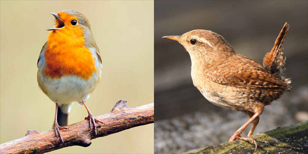
Robin
The people’s favourite. Pros: easy to characterise for the logo. Red colour palette – arguably our primary colour already with the red buses and phone boxes. Cons: strong Christmas connotations? Very territorial and quick to drive away intruders, so would get the anti-immigration vote. What does it stand for? A likely winner nonetheless.
Wren
Small but with a big voice. A great metaphor for our little island. Good simple brand story. The logo might be problematic though, not the most visually exciting bird. Not sure it would pass the competitor test, next to all those eagles.
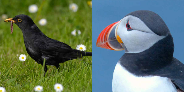
Blackbird
Would have a nice theme tune? That’s about it.
Puffin
Great logo and merchandise potential. Comedy is one of the UK’s best exports, and there’s just something funny about puffins. However, a bit overly Scottish to represent the whole country, especially in the current climate…
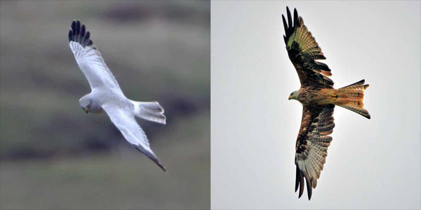
Hen harrier/red kite
Good opportunities make a bold statement about conservation. Red kite has a good brand story to tell about its reintroduction to the wild.
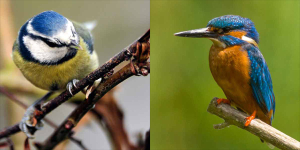
Blue tit
Wouldn’t make it past the ideas stage. Sorry, blue tit.
Kingfisher
Best colour palette potential. Rapid mover and a dash of style. Paul Smith would do the uniforms.
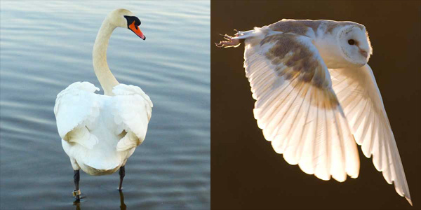
Mute swan
Strong regal connotations, and we have enough of those already… and as every child knows, they can break your arm with their wing which is hardly an appealing brand personality.
Barn Owl
Everyone likes owls. Charming but has a killer instinct when it’s needed. Can see in all directions – keeping a sharp eye on the world? Wouldn’t look ridiculous next to an American eagle, unlike some on this list.
Maybe the test is whether you can imagine Cameron/Miliband (delete as appropriate) marching into a G8 summit with one on a banner.
To me, it’s got to be the barn owl, with red kite and kingfisher second and third. We’d love to look at the visual universe at GW+Co – give us a tweet.
Joseph Harries is Design Director at GW+Co

