Sector
Brand Strategy
Not for profit
Work undertaken
Brand Strategy
Brand Identity
Messaging
Brand Communications
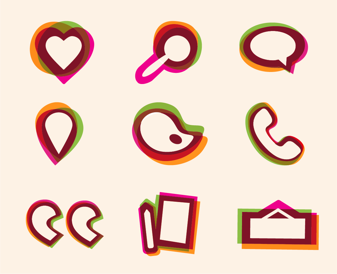
Illustration
UX (User Experience)
Website Design
Guidelines
Background
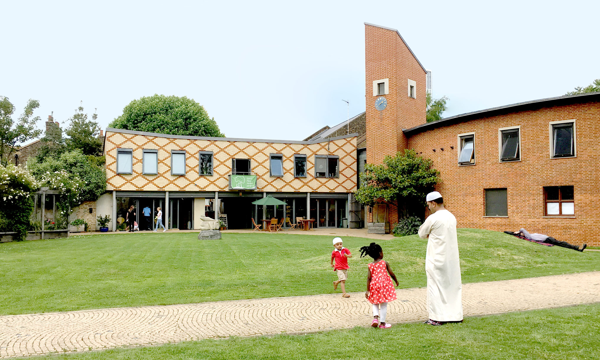
Bromley by Bow Centre, or BBBC, is a pioneering charity that has worked in one of London’s most deprived boroughs for over 30 years. They work to develop healthy, vibrant communities using a model that understands that health is primarily driven by social factors, not medical ones.
Challenge
Over the years BBBC had grown organically into a complex organisation. The main East London site contains a ‘community hub’ offering everything from job-seeking advice to art classes, an academic research wing, and an NHS GP practice with 27,000 patients, who also have two offsite practices in the local area. All these elements had different names, logos and websites, despite BBBC’s philosophy of holistic, not segregated, support.
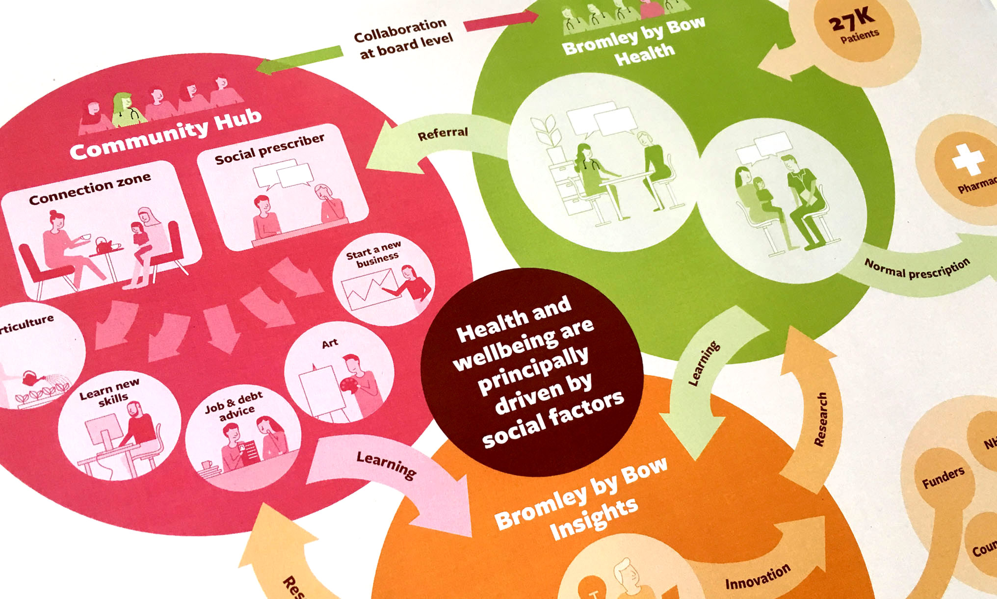
Mapping the model
We began by working closely with BBBC to visually map their working model, to give everyone a better understanding of how the three parts fit together – the community hub, health centre and research school. As this was the first time anyone outside the organisation had tried to get the complete picture, this has since become a vital tool.
Brand structure
We completely overhauled the BBBC brand, rolling three identities into one system, with a single new adaptive logo representing both the three ‘B’s in the name and the three offerings of the Centre. Specific ‘health’ and ‘insights’ sub-brands now clearly work as one family.
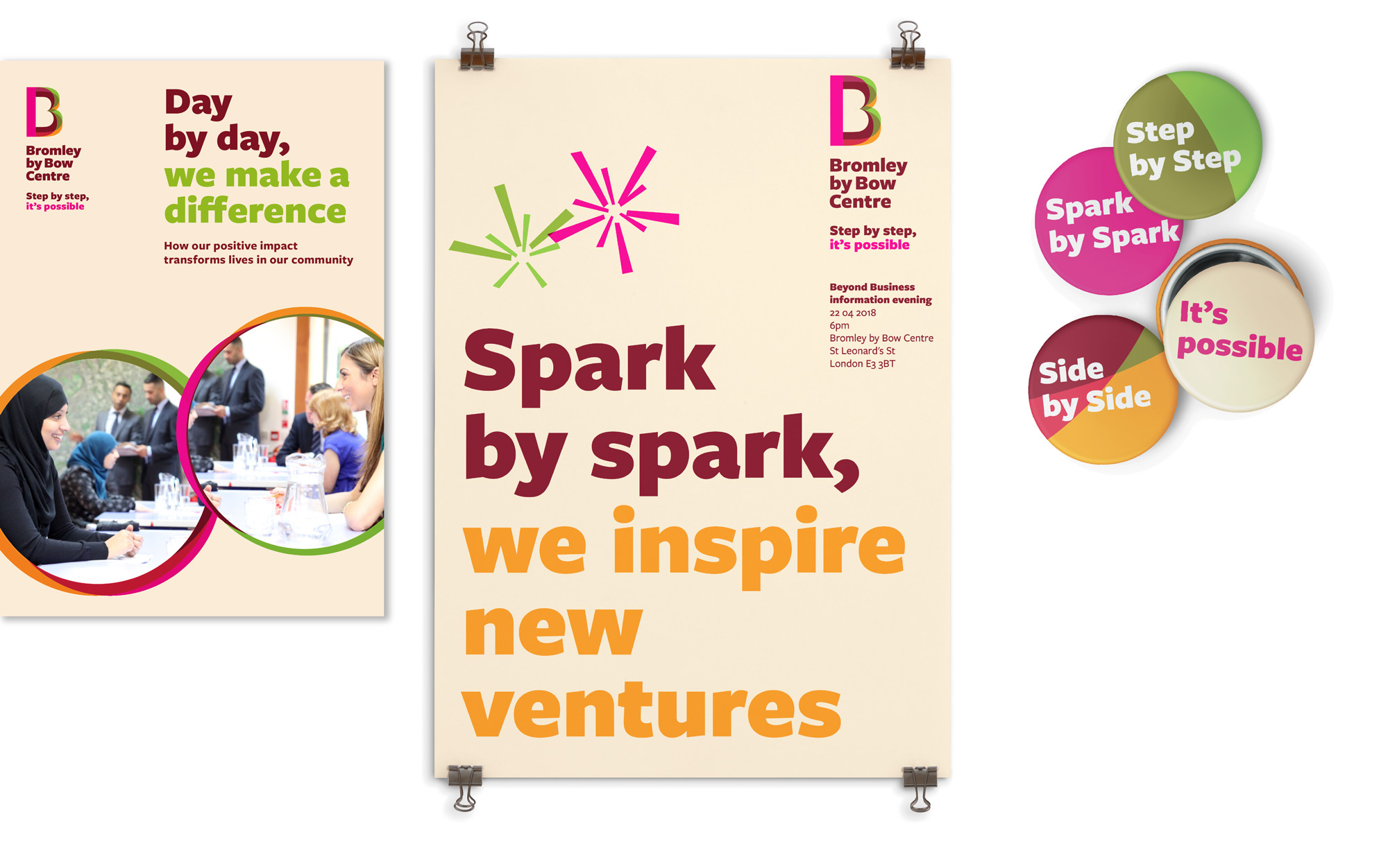
BBBC believe that great change can happen if tackled one step at a time.
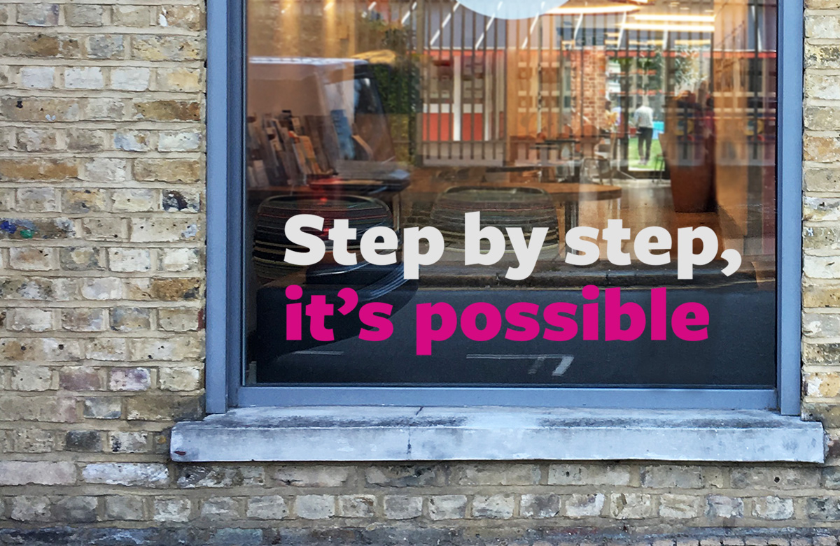
We captured this philosophy in a strapline – step by step, it’s possible.
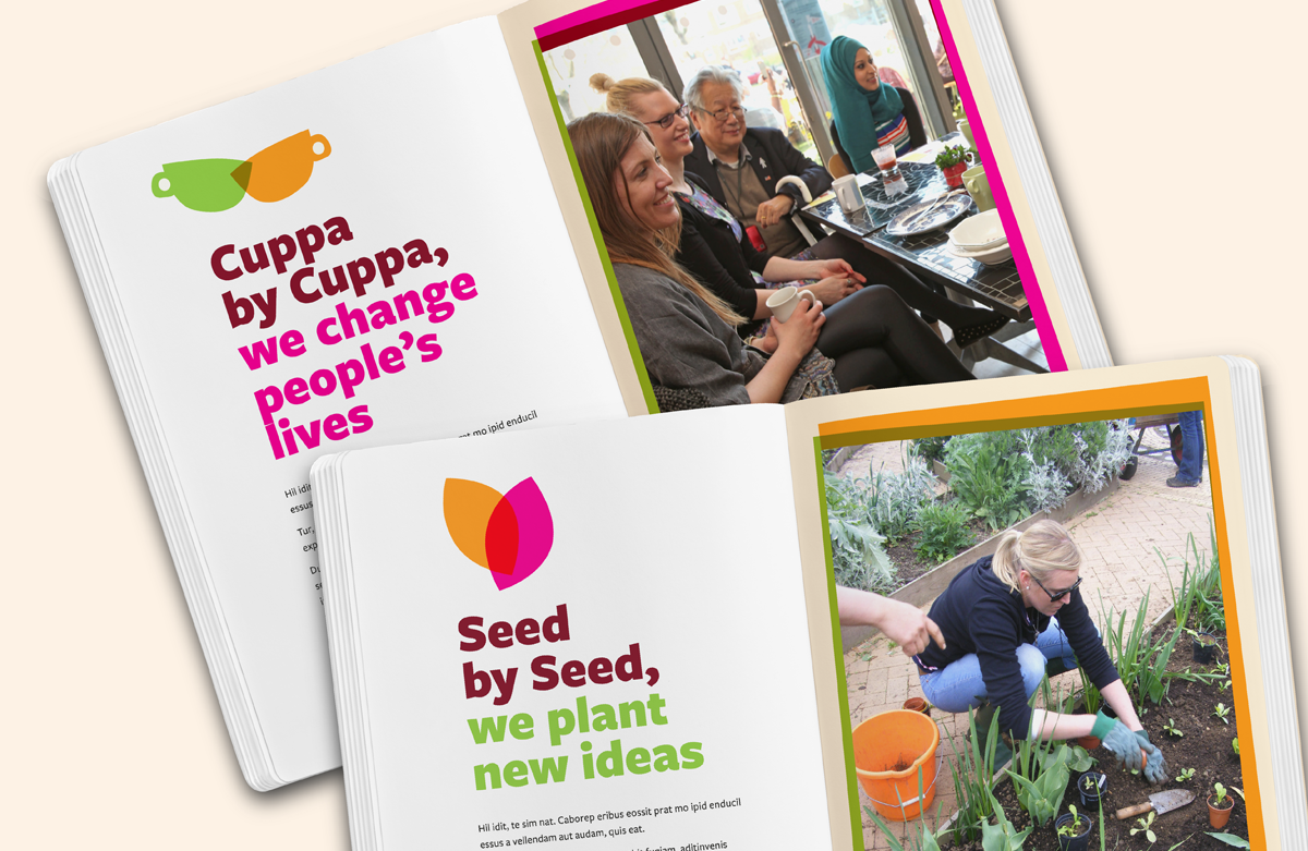
Inspired by the word ‘by’ in their name, we turned this strapline into a system of writing headline messages that BBBC could make their own.
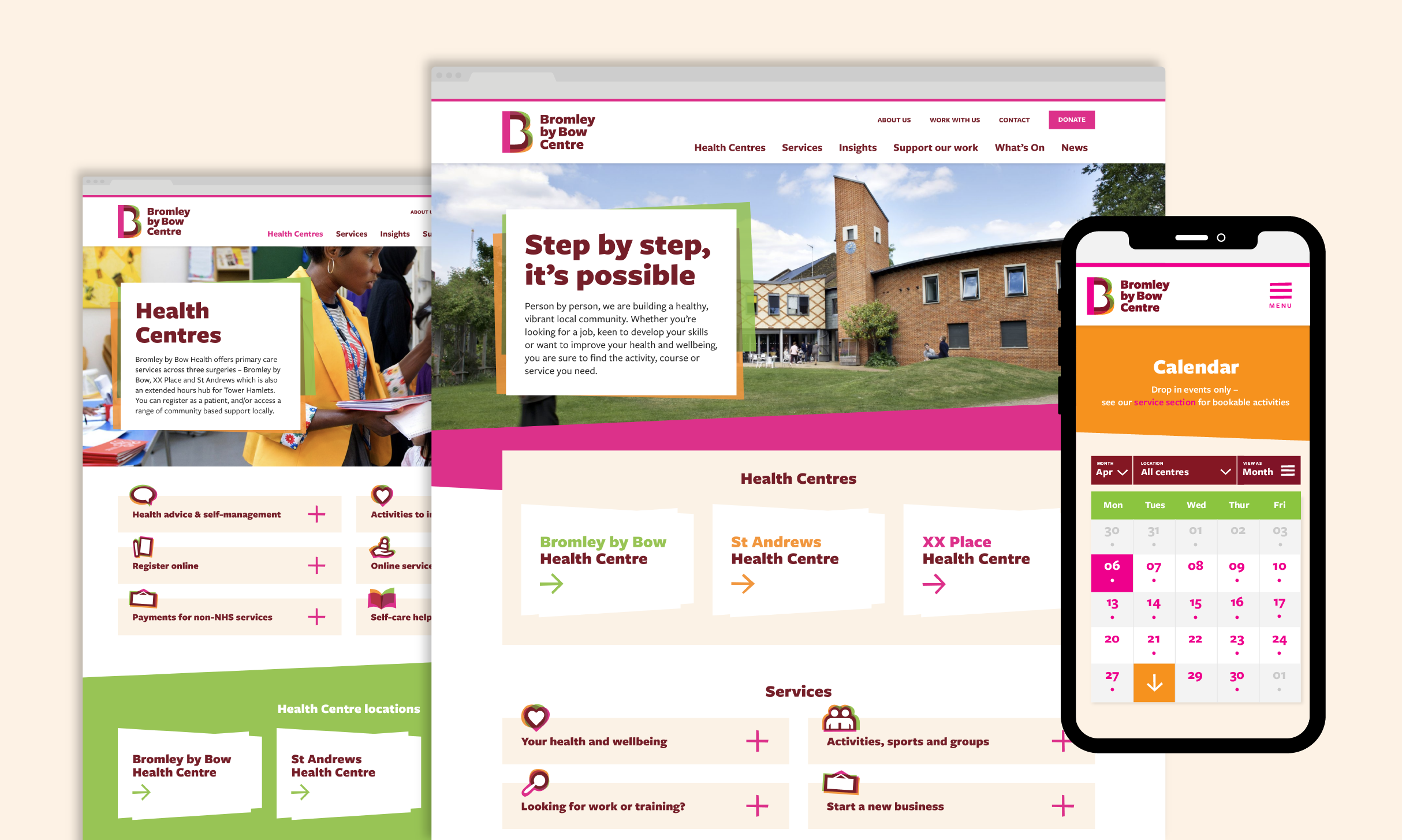
Website
We developed a comprehensive new website that encompassed the community, health and research offerings for the first time. BBBC’s users, or clients, come from all walks of life and often have limited digital skills, so the site was designed from the ground up with their needs in mind. The final site design is fully flexible to accommodate the large and growing amount of content the team produces.
Website results
49%
increase in users
53%
increase in page views
Design
We wanted to create a brand that the team at BBBC would love working with. Overlapping shapes in three colours became a bold new design language applied to illustration, image frames, page backgrounds and more. A single typeface and simple graphic style ensure the brand identity can be easily used in communications by anyone at the centre.
Visit the website