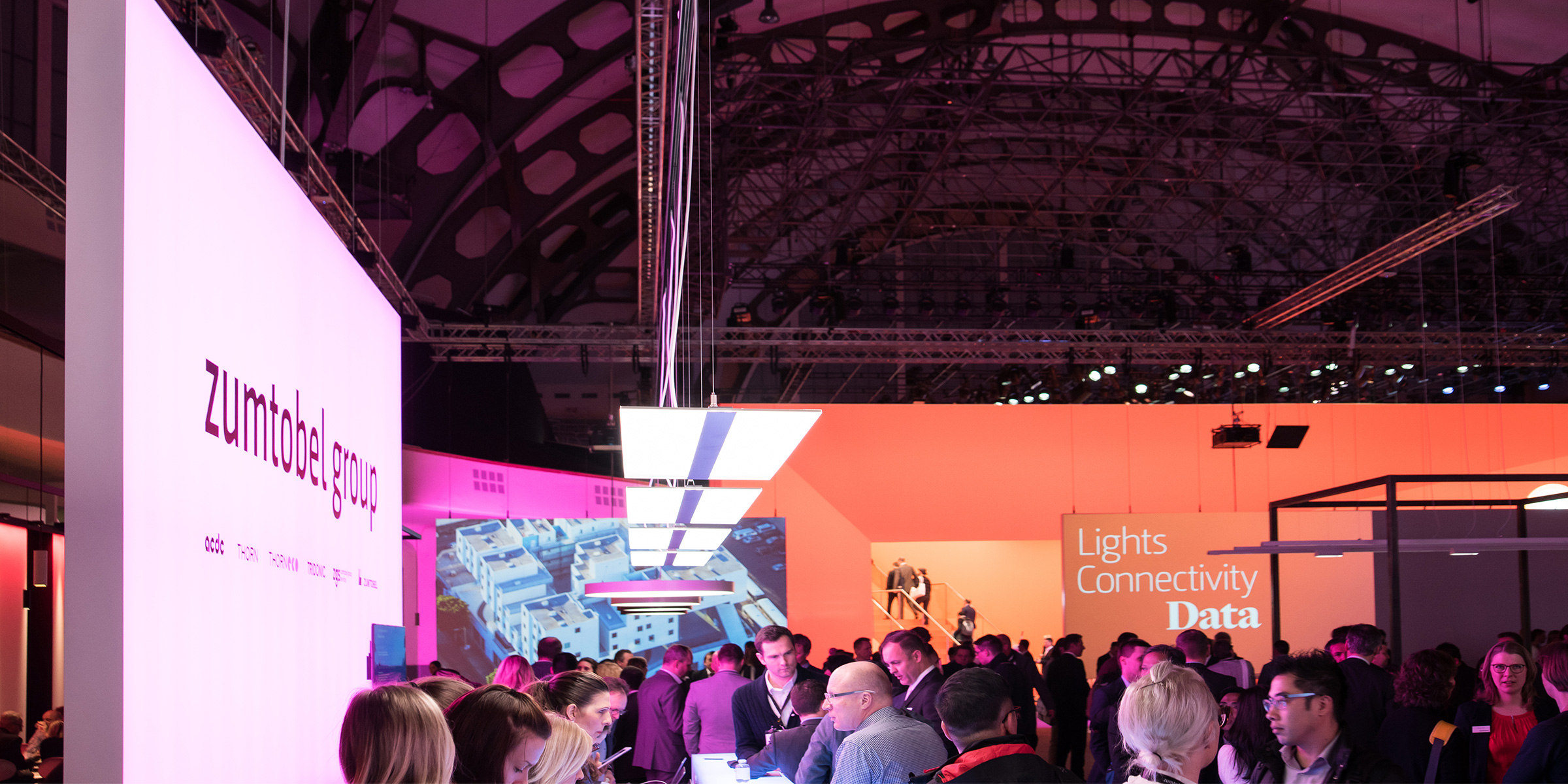
Watch the brand video above with sound (recommended)
Awards
Best Use of Typography at Transform Awards 2019
Sector
Manufacturing (Lighting)
Work undertaken
Brand Strategy
Brand Identity
Tone of Voice
Creative Writing
Marketing Communications
Animation
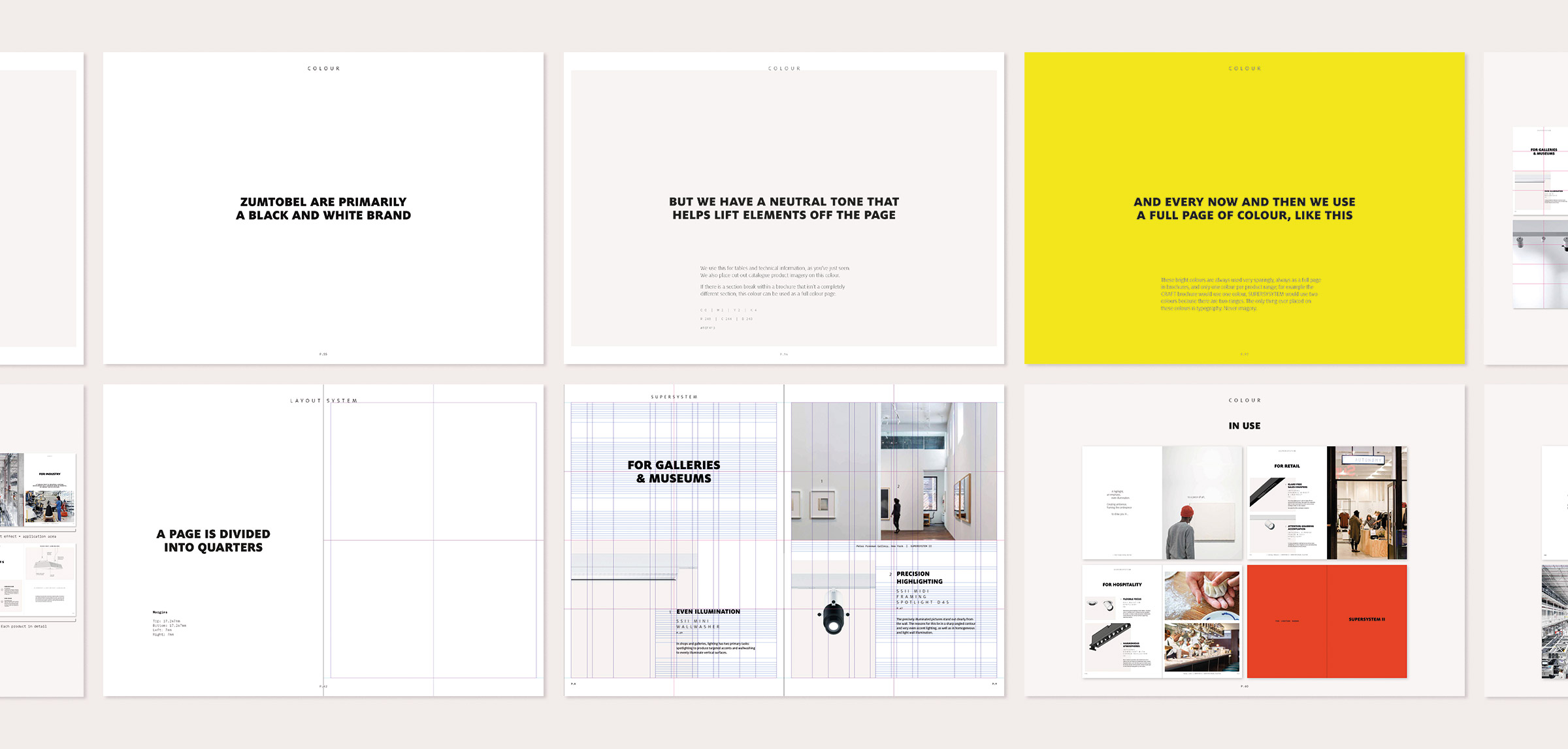
Guidelines
Background
Zumtobel are one of the world’s leading lighting manufacturers, producing premium products for use in art galleries, retail, hospitality and industry. The brand’s focus has for several years been on ‘human-centric lighting’: light that supports the body’s natural bio-rhythms to improve quality of life. Despite this, their communications have become very cold and unemotional.
Working closely with the internal brand team, we updated every aspect of the brand in order to reinvigorate Zumtobel for a new age.
Strategy
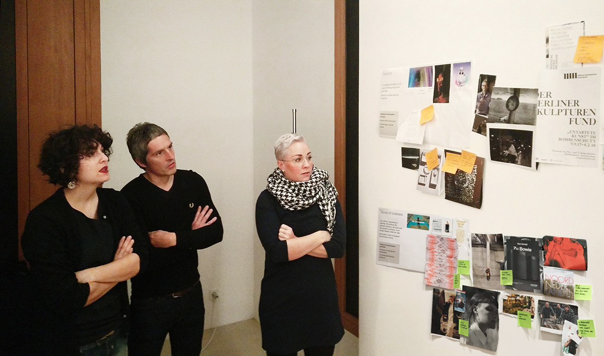
Over several collaborative workshops, we uncovered the best of the brand’s past and found a desire amongst their team to get back to the more uncompromising, artistic approach that was part of Zumtobel’s DNA. With a newly-articulated purpose – ‘to improve quality of life through light’ – we worked to move the brand away from the safe, minimal image of the present, whilst maintaining a premium position consistent with the brand’s long heritage.
We shifted the focus away from the products themselves, and towards the real benefits that great lighting can bring to our wellbeing and productivity levels.
Brand idea
The effect of great light – and its effect on us.

Showing the effect, not the product
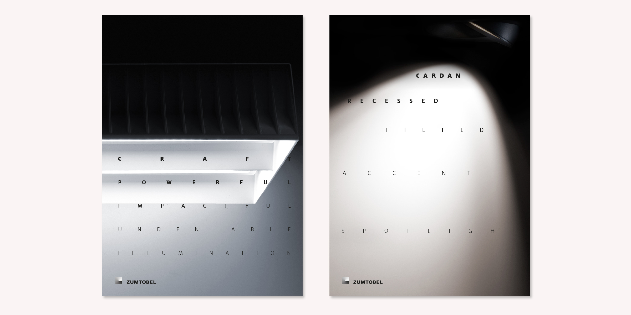
We developed a new approach to photographing Zumtobel products, breaking with the conventions of the sector. Rather than plainly showing the design, the focus is on the light effect it creates – whether a sharp spotlight or a diffused gentle glow.
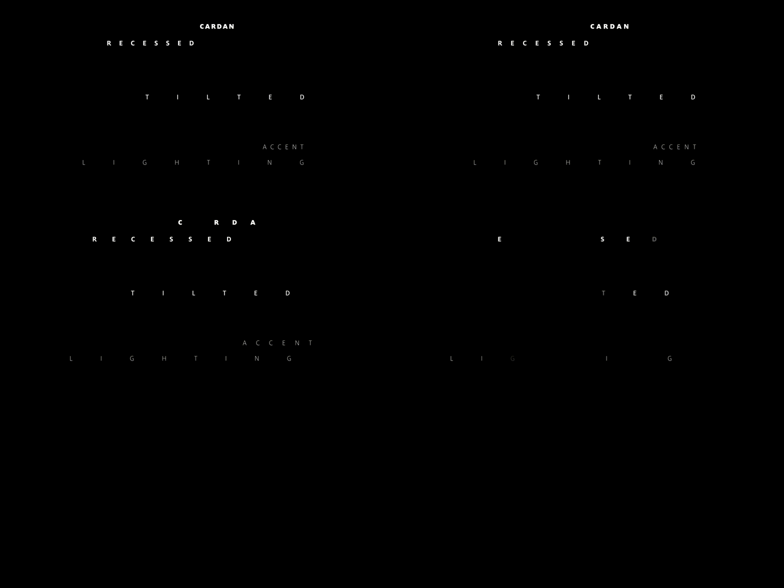
Typography like light particles
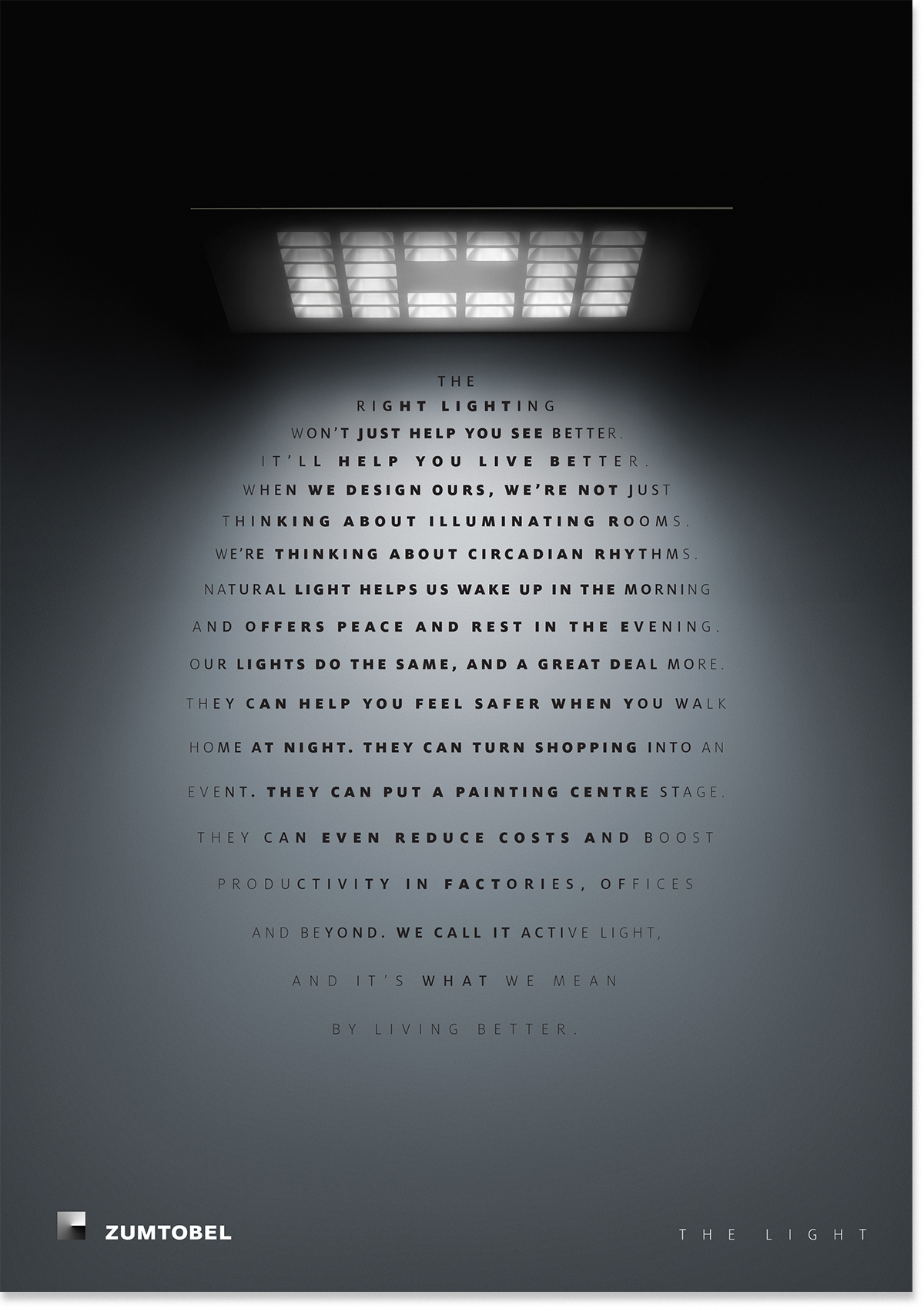
Central to the brand communications is a typographic style that takes its inspiration from the way light particles diffuse through the air, creating a playful system that can shape itself to different lighting effects.
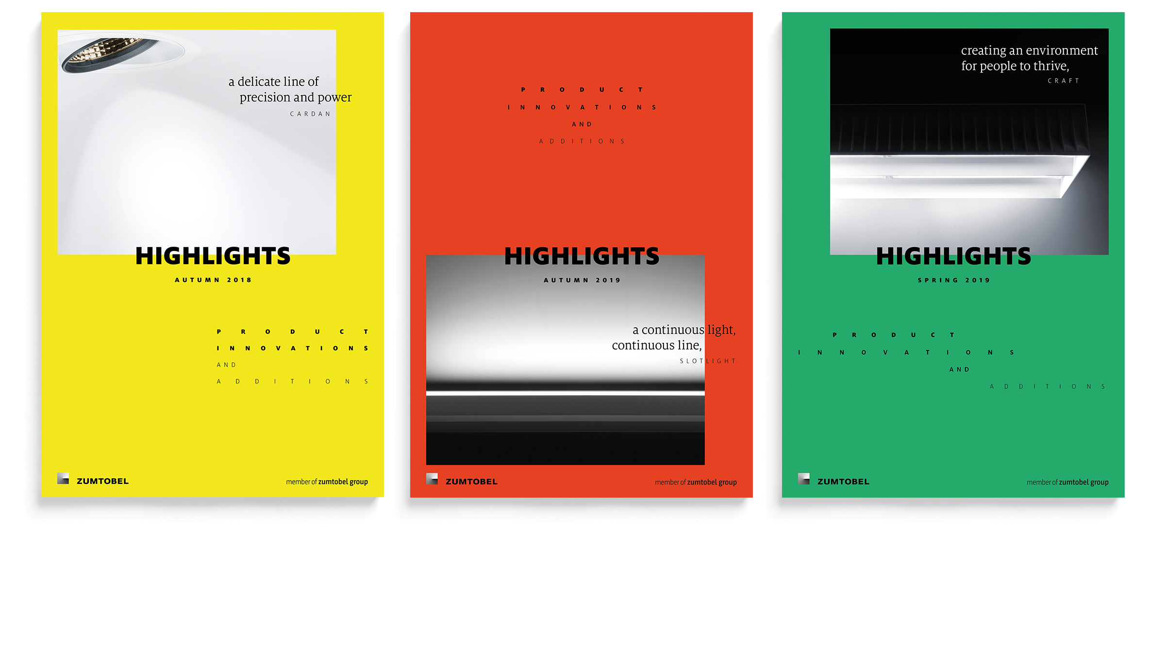
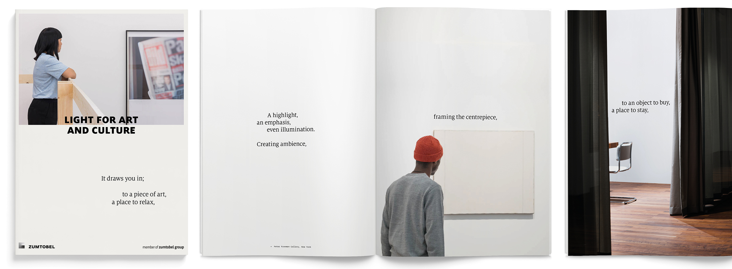
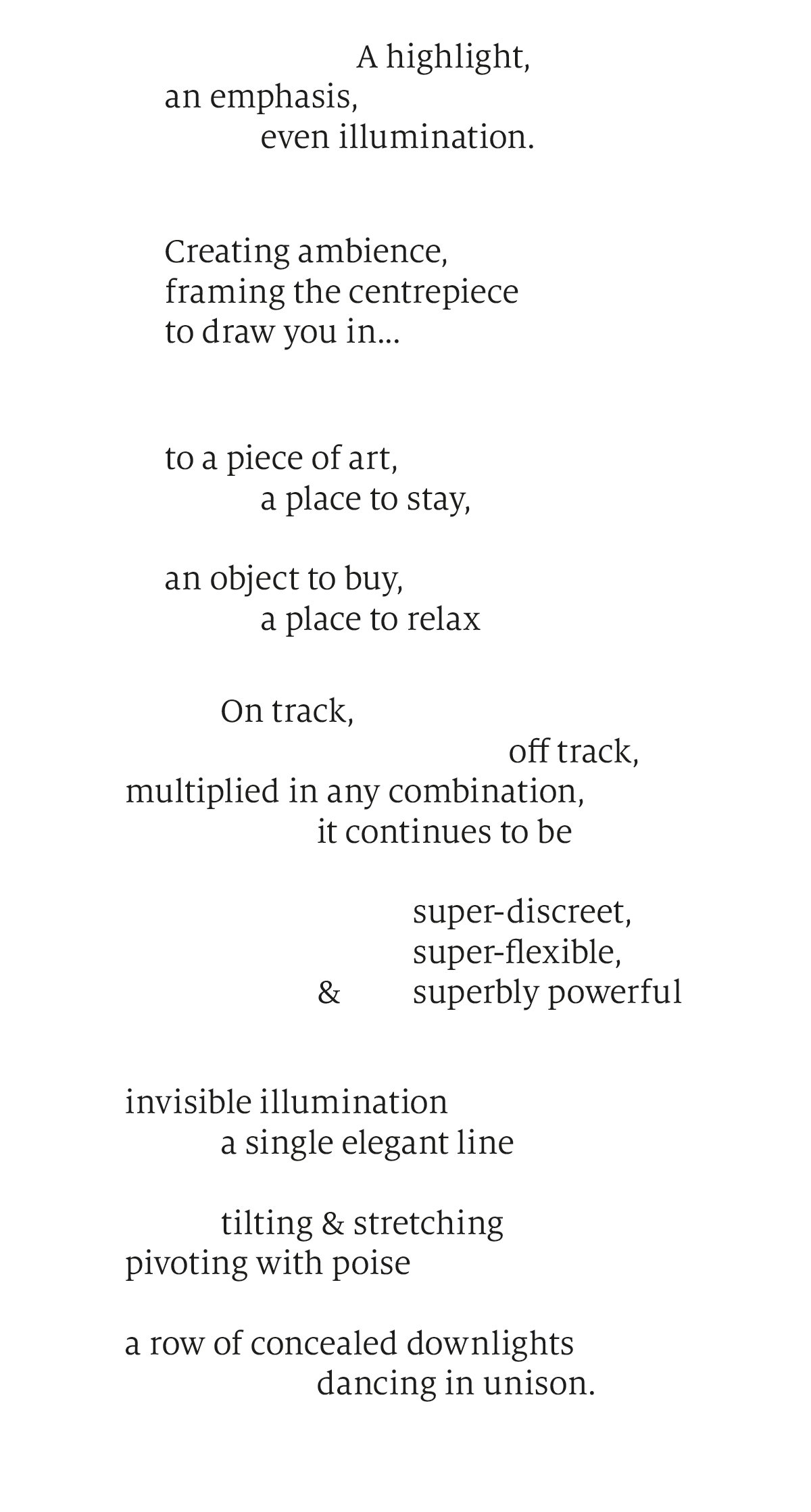
Poetry on how light affects us
Instead of industry-typical marketing speak, we turned messaging into poetry that tells evocative stories about what great light feels like and what it enables us to do. A deeper story begins to unfold when the poetry is combined with clean but evocative photography, capturing people’s experiences with light, whether at work or browsing in an art gallery.
The result
In a sector led by glossy product images and generic messaging, Zumtobel once again stands out through playfulness with imagery, typography and language. The brand has found its edge, with a brand thoroughly in line with its tone of voice – graceful, passionate, with a touch of the avant-garde. Updated communications guidelines are now being adopted by the global brand team.

