‘Clean, flexible and contemporary… we now have the tools to properly sell multi-brand.’
Anna Sutter, Head of Brand, Zumtobel Group
Sector
Manufacturing (Lighting)
Work undertaken
Brand Architecture
Brand Story
Brand Identity
Graphic Design
Guidelines
Animation
Literature System
Employee Engagement
Background
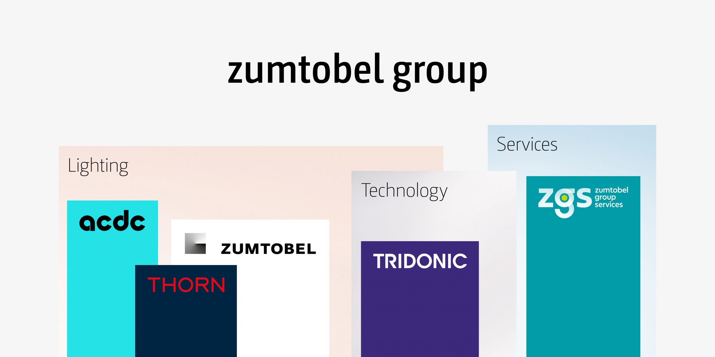
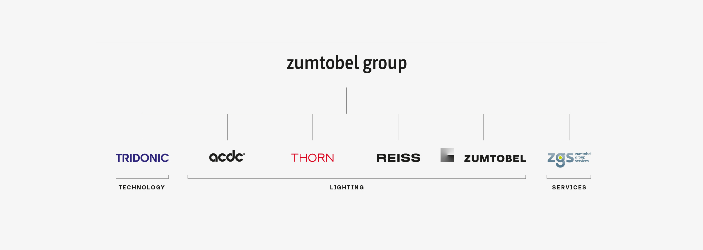
Zumtobel Group are the parent organisation to six lighting brands, each with different market offerings. Marketing these as a harmonious package, not as competitors, has a clear benefit for both customers and the Group itself. We worked with management to articulate how the group relates to its brands, and we were well placed to establish an identity for the group as a whole.
Process
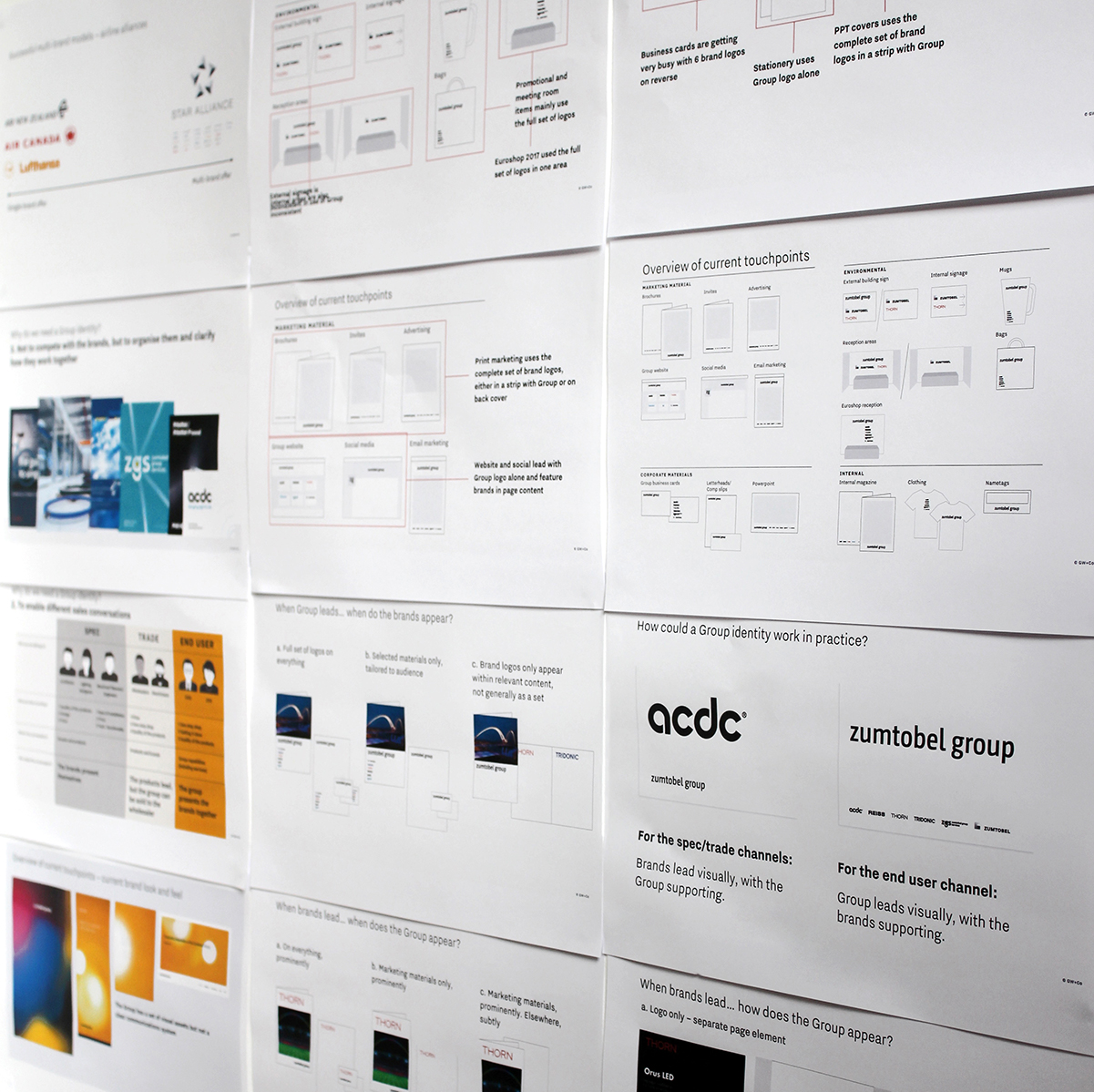
The project began with a thorough audit of how the existing identity was being used, and misused, across hundreds of applications. We established clear principles of where and how the Zumtobel Group identity should appear, and its hierarchical relationship with the lighting brands.
Design framework
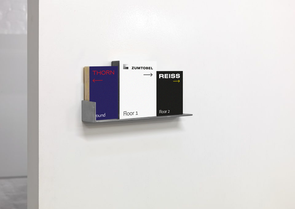
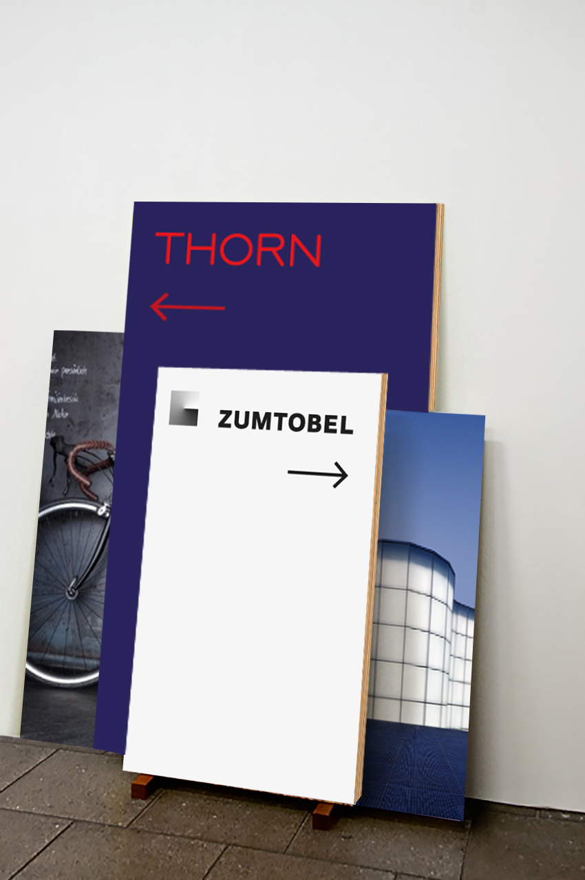
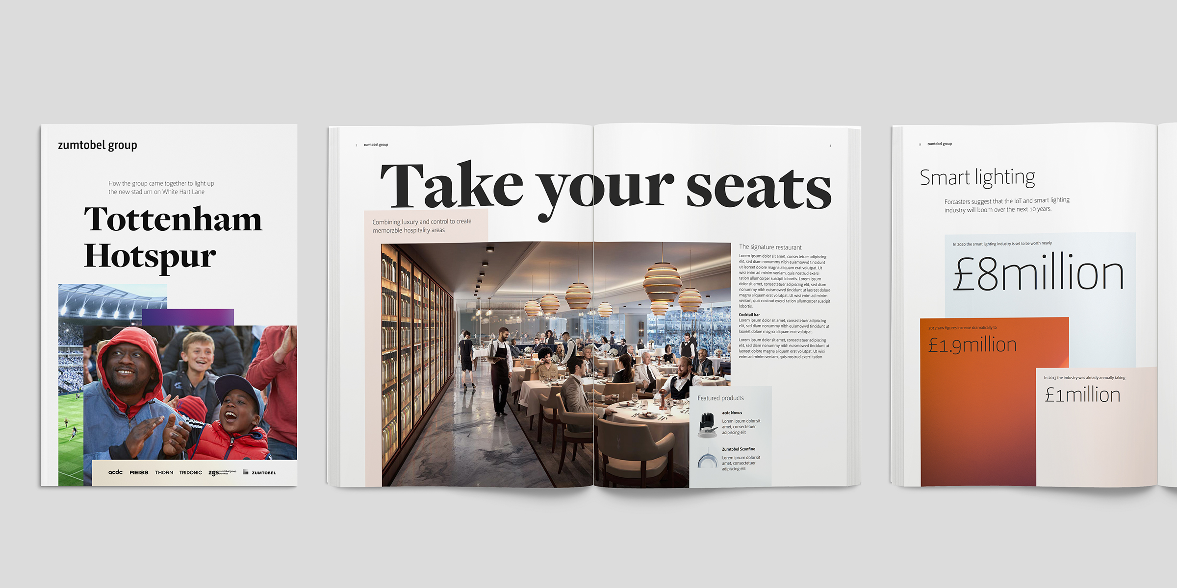
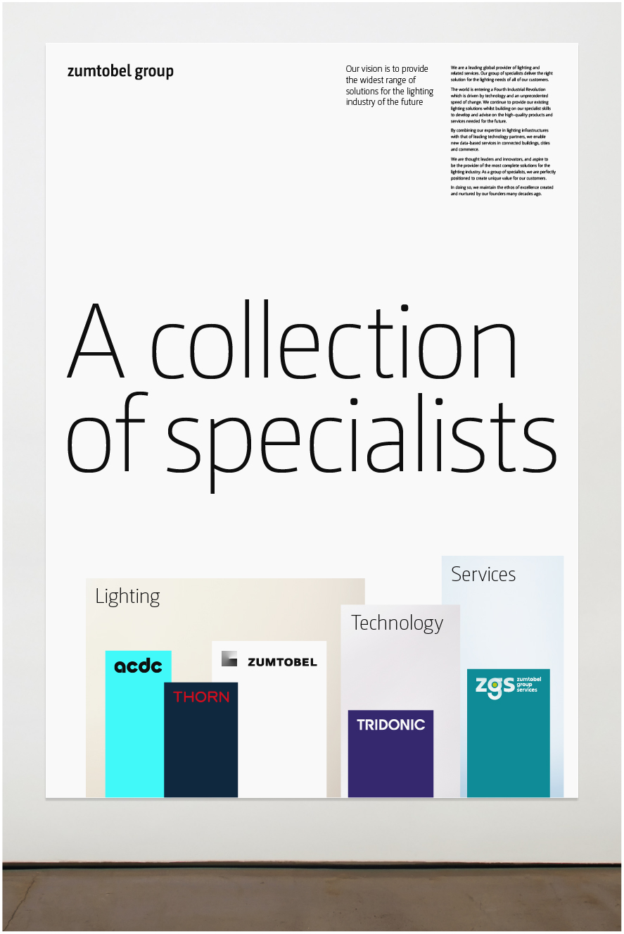
Group-branded materials required a clear visual identity, but one that shouldn’t fight with the brands within. We proposed a simple metaphor that became the backbone of the visual language – that the group should be the neutral ‘gallery wall’ against which the overlapping branded content can rest in panels.
A lovable system
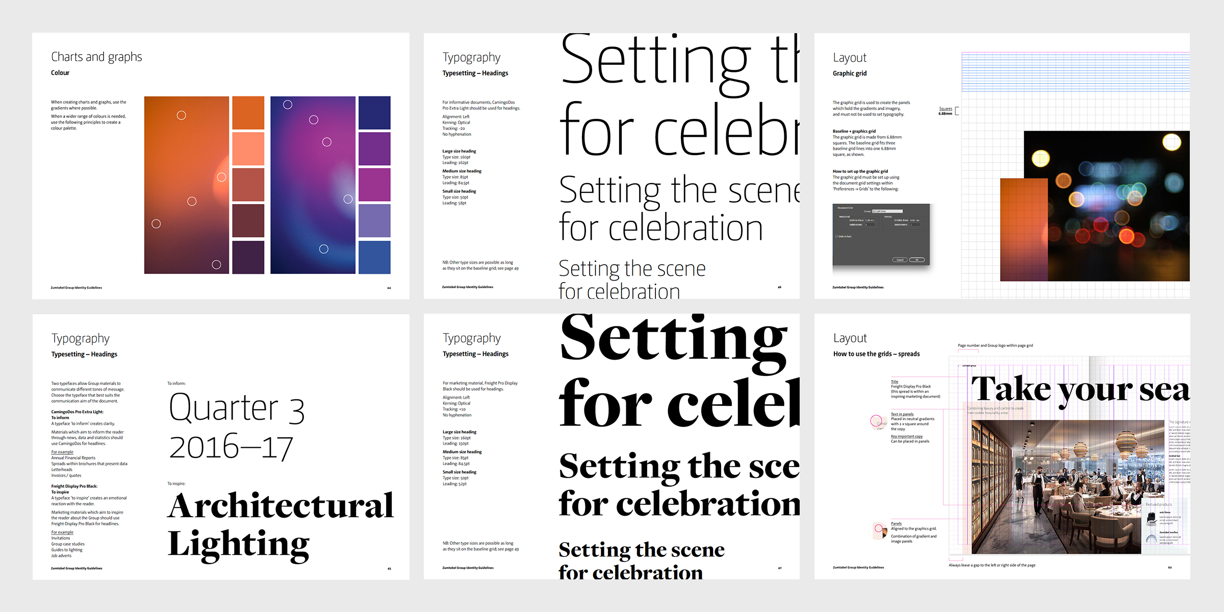
The panel-based design is extremely flexible, yet unifying. That allows the in-house design team and other agencies to bring a message to life without compromising consistency.
Colour
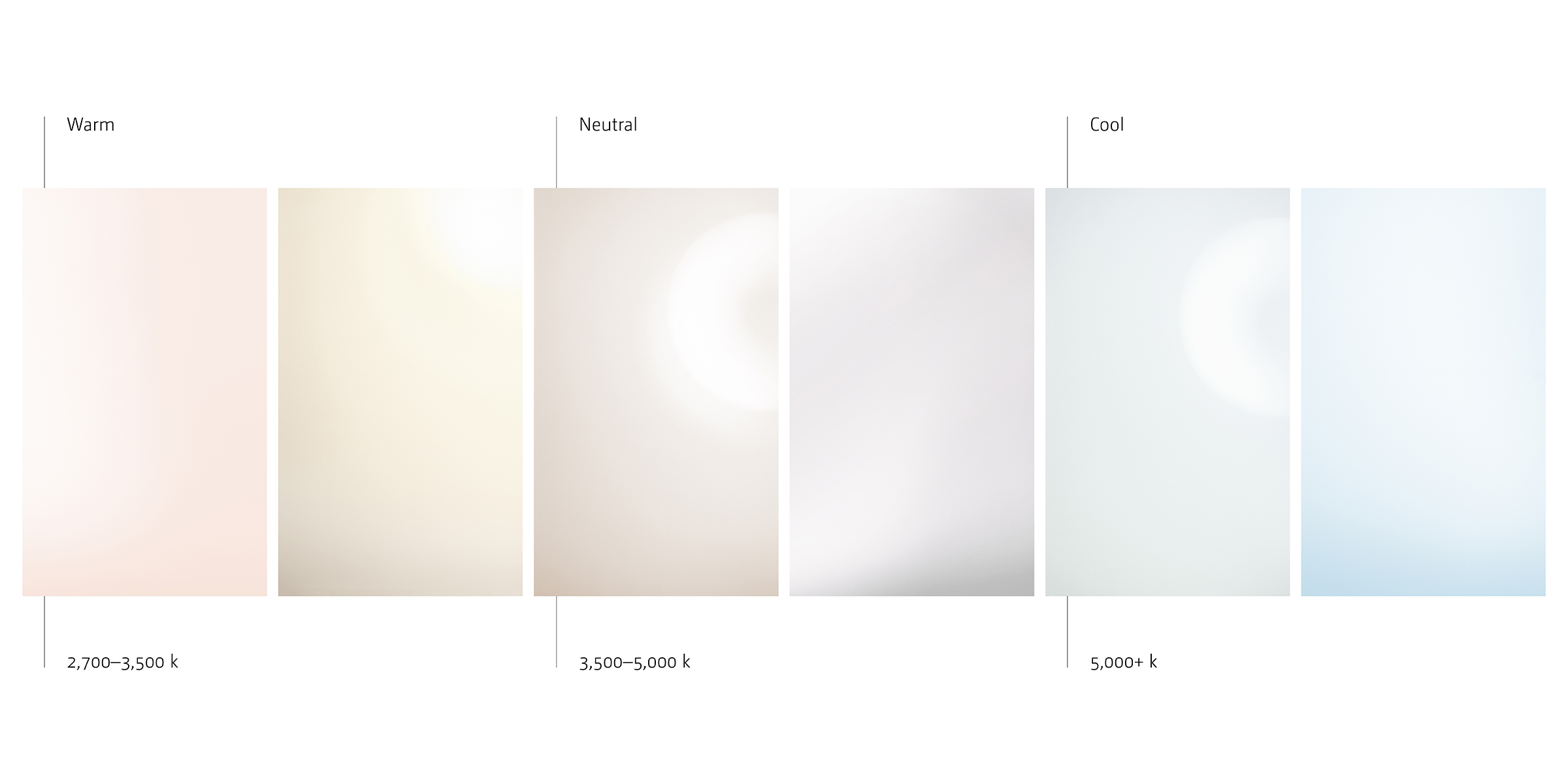
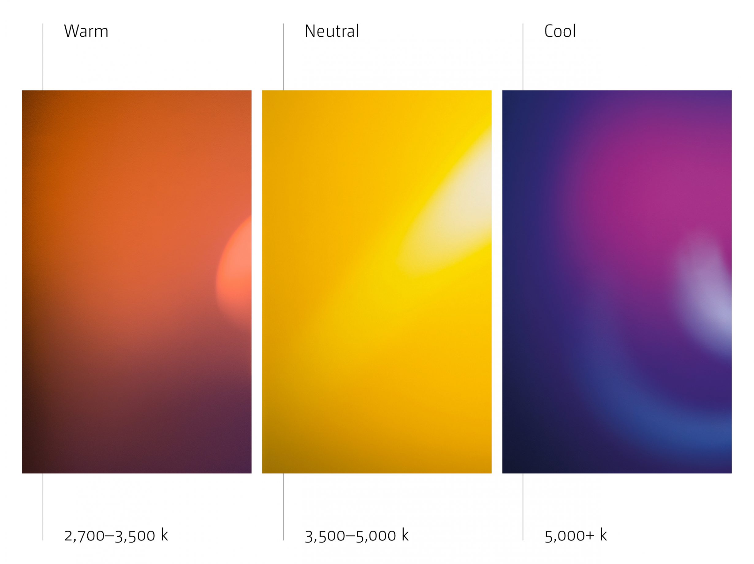
The colour palette was created by photographing real light and capturing the tonal range of the kelvin light scale. A brighter palette was formed using the same process, but using intensified highlights that didn’t compete with the individual brands’ colours.
Results
The comprehensive identity guidelines we produced have given clarity to future group communications. An understanding of how to sell the group’s brands as a package is opening up huge opportunities, and there’s a growing sense of unity for the group’s thousands of employees.

